Work Smarter with a Design System
A modular design system built for a project-management app
I used a familiar workspace — project dashboards — as a canvas to explore how tokens, components, and documentation come together in a scalable design system.
The result is a flexible, token-driven foundation that supports multiple modes, densities, and patterns.

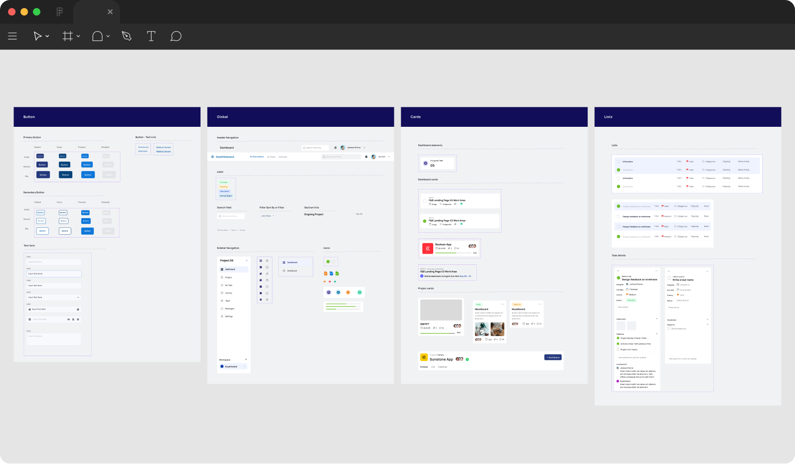
🧱System Foundations
System Foundations
I started by defining the system’s DNA — color, spacing, typography, and radius tokens.
Each variable is mode-aware, allowing instant updates between light/dark and comfortable/compact density modes.
This foundation ensures every component inherits consistency automatically.
Each variable is mode-aware, allowing instant updates between light/dark and comfortable/compact density modes.
This foundation ensures every component inherits consistency automatically.

🧩 Components
Reusable Components
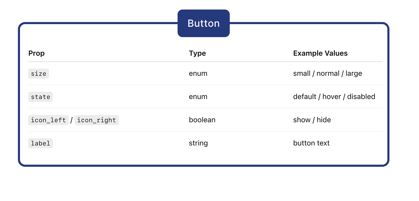
Every component in ProjectFlow DS is built on tokens and variant logic.
Properties mirror developer props, so designers can toggle state, size, or icon visibility directly in Figma — just like in code.
This structure keeps components flexible, predictable, and easy to hand off.
Built with Figma Variants, Boolean controls, and semantic tokens — this Button demonstrates how design and code share the same logic through props and states.
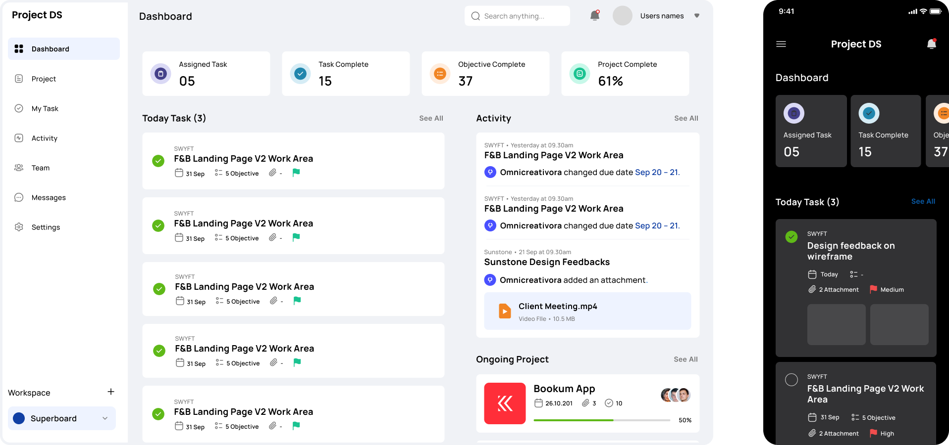
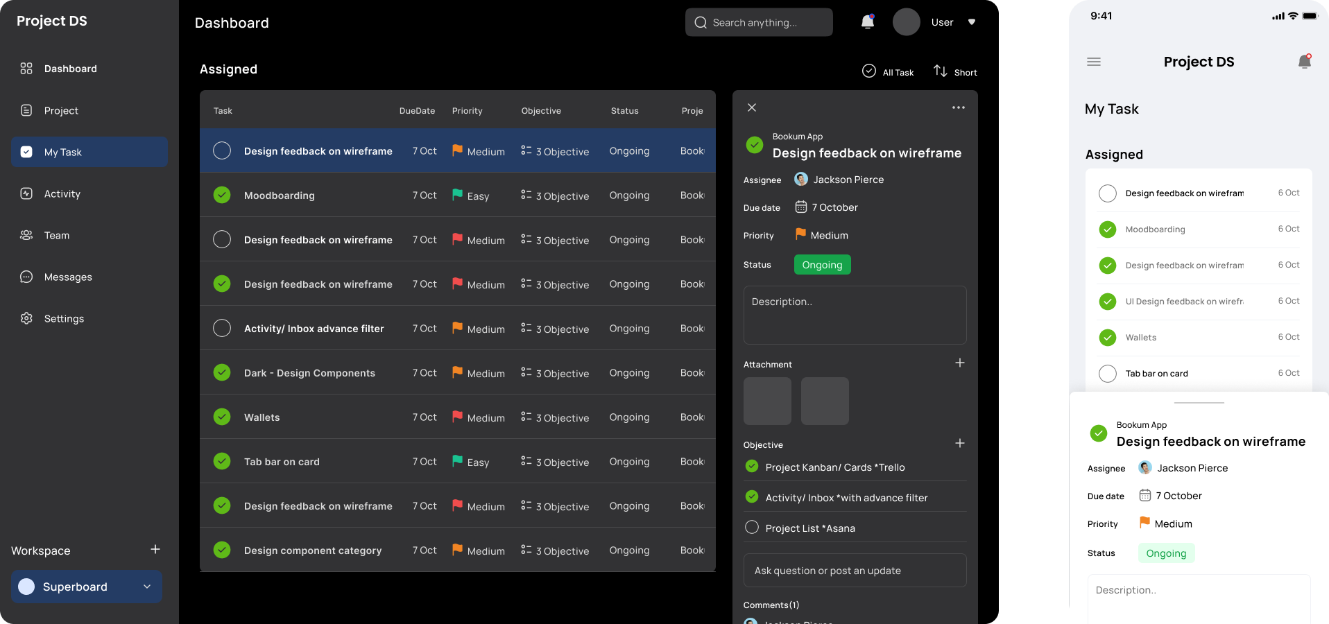
📱Patterns & Screens
Patterns & Real Screens
The system scales across multiple views — from dashboards to Kanban boards and mobile.
Each screen reuses the same building blocks, proving that consistent tokens and components can flex across complex layouts without manual overrides.
📘Documentation Example
Documentation & Developer Alignment
Each component is documented using a consistent Figma template: overview, anatomy, props, states, accessibility, and design↔code mapping.
This format mirrors Storybook documentation and makes the design system easier to scale with engineering teams.
Component Documentation
Task Card
The card displays key project or task details in a clear, consistent container.
🔩 Anatomy
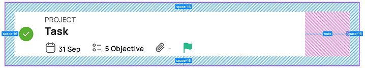
⚙️ Props
Element
Default
Values
Type
flag
enum
done, pending, failed
pending
flag
enum
easy, medium, hard
easy
image
boolean
true / false
true
🔗 Design ↔ Code
Element
Design Token
Code Variable
Card container
bg-surface
,
radius-8
,
space-16
var(--bg-surface)
,
border-radius: 8px
,
padding: var(--space-16
Title
text-default
,
font-size-lg
color: var(--text-default)
,
font-size:
var(--font-size-lg)
Label / Meta text
text-muted
,
font-size-sm
color: var(--text-muted)
,
font-size: var(-
-font-size-sm)
✅ Do
- Connect card fields to clearly defined data sources (task.title, task.due_date, etc.)
- Handle missing or empty data gracefully (e.g., show “—” or “No files”)
- Maintain consistent token-based spacing and hierarchy
🚫 Don’t
- Hardcode placeholder text or static values into final components
- Overload cards with rarely used or inconsistent data fields
- Let variable-length data (long project names, large counts) break the grid
🎨 For Designers
✅ Do
- Use Task Cards for clear, action-oriented content — tasks, projects, or assignments.
- Keep layouts simple and scannable — title, status, supporting details.
- Follow system spacing and alignment; never resize or nudge manually.
🚫 Don’t
- Change colors, type, or shadows outside system tokens.
- Detach or override components for one-off visuals.
- Mix light/dark or compact/comfortable modes on the same screen.
💡 Reflection & Next Steps
Reflection
ProjectFlow DS taught me how structure creates scalability — and how documentation builds trust between designers and developers.
Even as a solo designer, I built this system as if I were collaborating with an engineering team: tokens, variants, and docs all mirror real product logic.
Next Steps:
- Export tokens as CSS variables for dev use
- Create Storybook parity for components
- Add usage analytics and accessibility tests