Procore
2025
Product Updates Newsletter Template
Campaign Design
Web Production
Figma Components
Visual Design
Brand Guidelines
My Role
Lead Visual Designer
Owned the end-to-end visual design of the Product Updates Newsletter system (desktop + mobile layouts, components, and reusable visual kit).
Timeline
August 2025
Outcome
Delivered a scalable, brand-consistent newsletter framework that standardizes Product Launch, Feature Release, Coming Soon, and Beta communications—reducing one-off redesign and improving readability across devices.
16
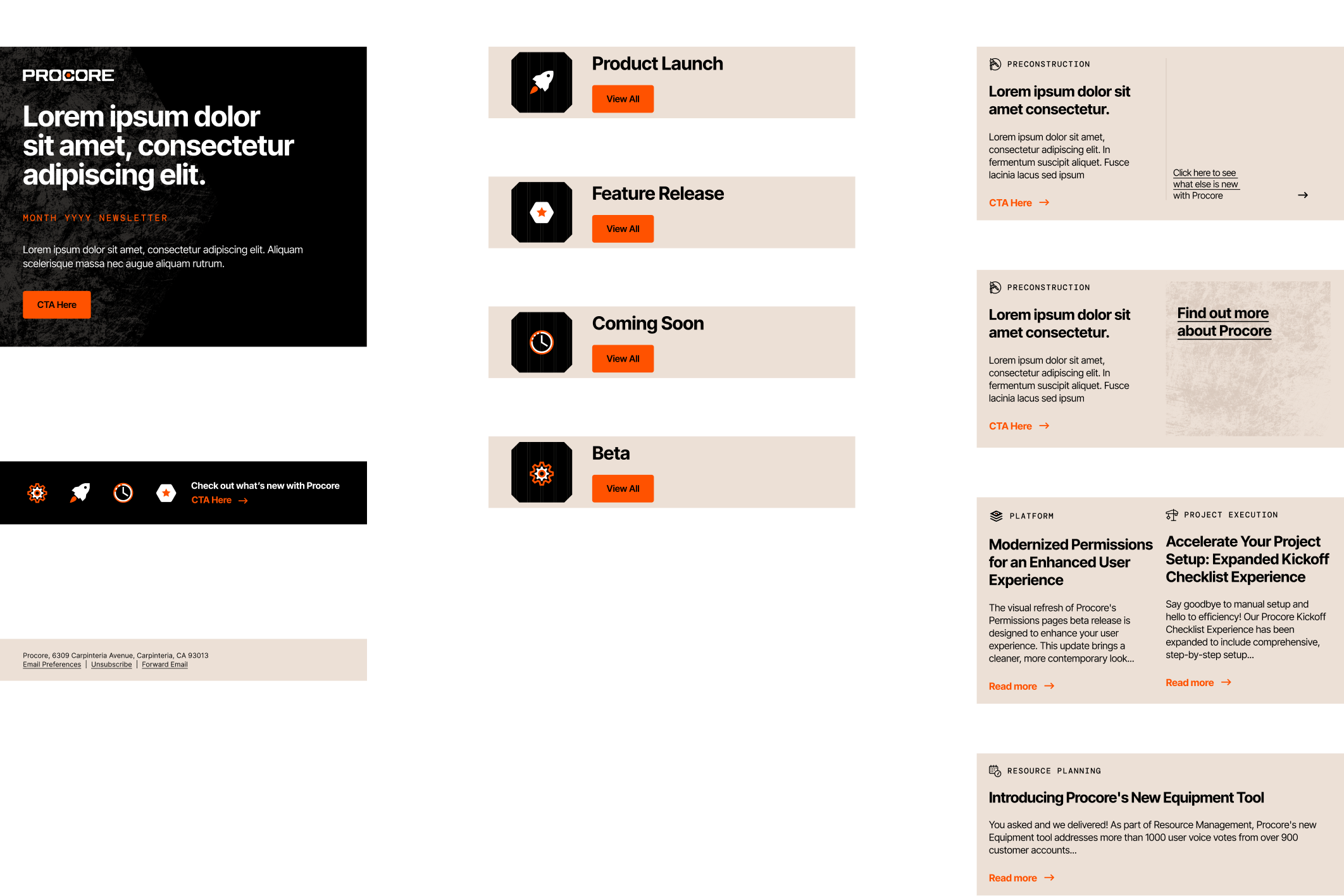
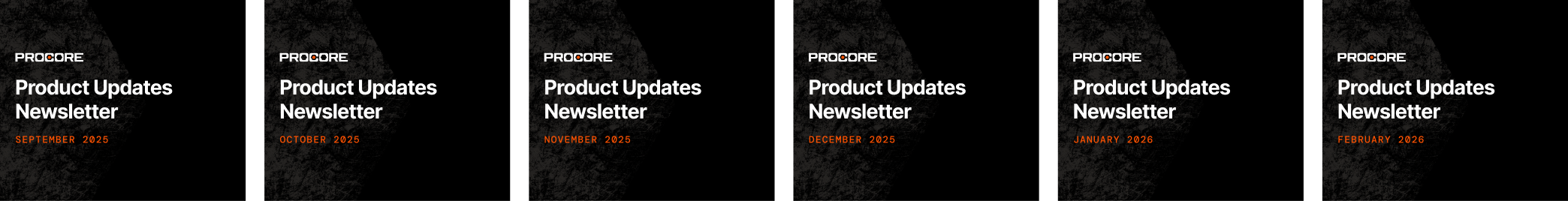
Monthly Headers
Prebuilt header covers to maintain a consistent cadence without redesigning the hero each month.
4
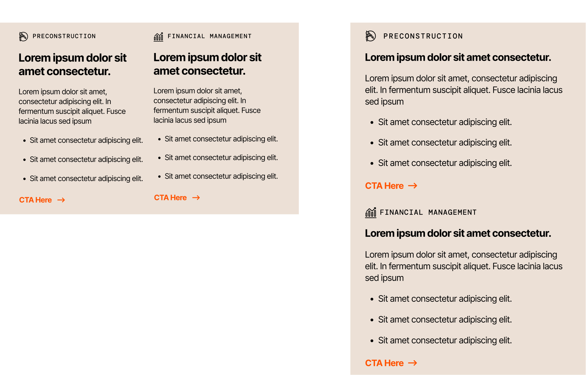
Standard Release Modules
Reusable sections with consistent CTAs and solution blocks for repeatable assembly.
Context
Procore ships recurring product updates across multiple solution areas—this template system standardizes each monthly send so it’s faster to assemble and easier to scan.
The Challenge
A monthly newsletter needs to be repeatable, even when content isn’t.
- Inconsistent hierarchy across issues (headline / CTA / section drift)
- Unreliable inputs (missing fields, long copy, inconsistent assets)
- High production overhead (each send becoming a one-off build)
Goals
- Fast to produce (modules > one-off layout)
- Built for scanning (clear hierarchy + predictable CTAs)
- Responsive by design (not a “shrunk” desktop)
- Content-governed (character + bullet guardrails)
- Resilient to real inputs (missing content + truncation states)
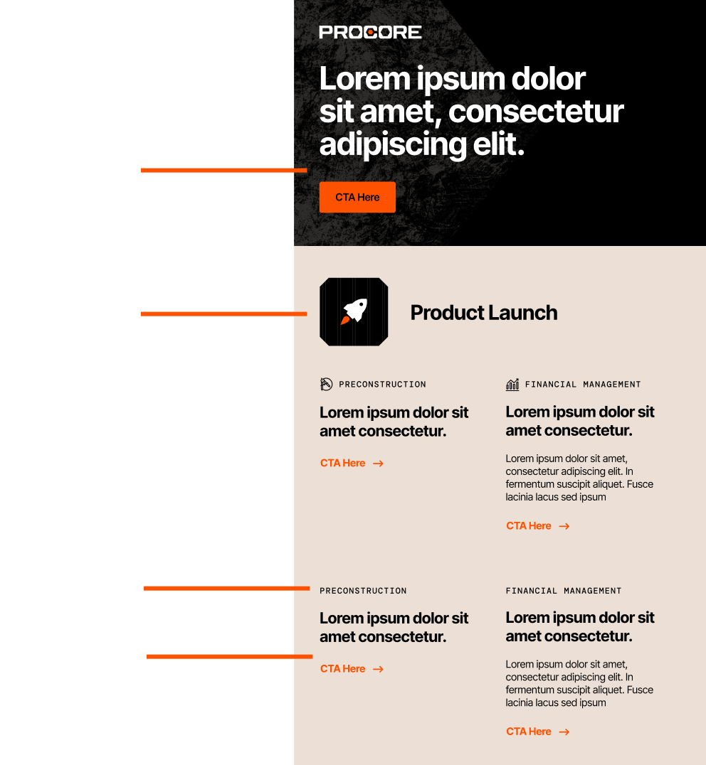
Solution
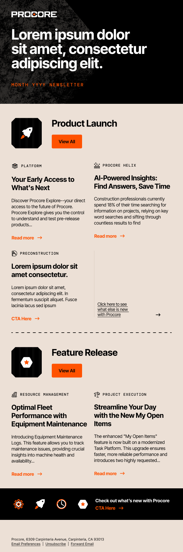
A centralized component toolkit that packages the newsletter into reusable parts—header, release sections, solution blocks, prefooter/footer, and icon set—so each issue can be assembled consistently.
Everything needed to build an issue lives in one place—modules, icons, and layout patterns.
Brand-Consistent System
Designed to match Procore’s visual language through disciplined hierarchy, restrained accent usage, and consistent UI patterns—so every issue looks and feels cohesive month to month.
- Type hierarchy optimized for scan-first reading
- Accent color reserved for CTAs + key metadata
- Icon + module patterns reinforce structure

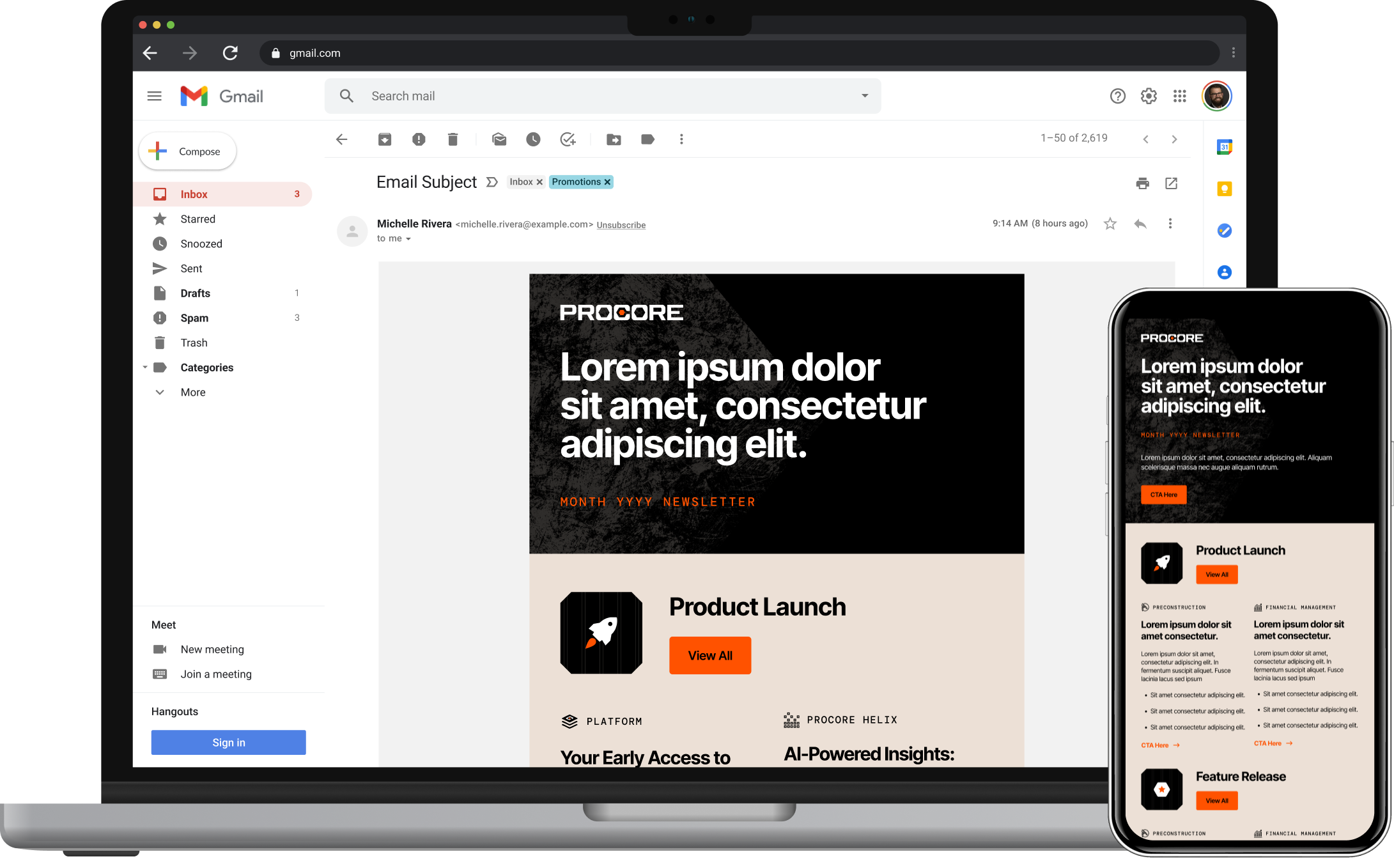
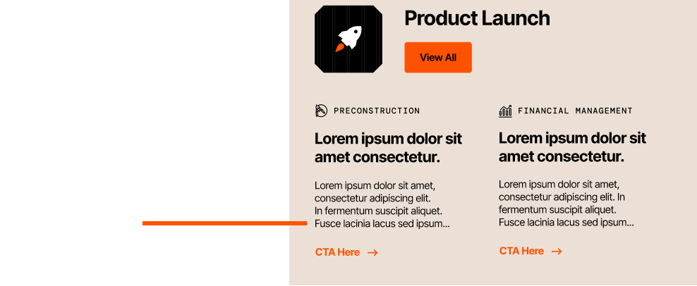
Responsive Design Approach
Instead of forcing a single layout to “collapse,” I designed parallel compositions:
- Desktop: supports comparison (multi-column where helpful)
- Mobile: stacked and tap-friendly for quick scanning
Monthly Header Library
Prebuilt monthly variants for consistent cadence (2025–2026)
Missing Fields + Truncation
A major part of the work wasn’t the “ideal” layout—it was planning for what happens when content is imperfect.
Missing Content States
I defined specific rules and visual fallbacks for scenarios such as:
- Missing body copy
- Missing bullet points
- Missing section release copy
- Missing solution body copy
- Missing icons (where applicable)
The goal: modules should collapse cleanly without leaving awkward gaps, broken alignment, or orphaned CTAs.
In practice, this means the layout still looks intentional even when contributors provide partial inputs.
In practice, this means the layout still looks intentional even when contributors provide partial inputs.
Truncation Rules
For over-length copy, I established a truncation pattern using an ellipsis and a clear continuation path:
- Cut copy at a defined point
- Indicate truncation visually
- Route the reader to the full content via the provided link
This protects layout integrity while still supporting deeper storytelling off-email.
Outcome
To make the system truly self‑serve, I wrote simple, visual instructions directly in Figma
What This Enables
- Faster monthly assembly through reusable modules + headers
- Less layout QA thanks to governed content rules
- More predictable handoff to marketing / production
Example Issue
A full desktop example showing how the modules assemble into a complete monthly send.