Inside Salesforce
2022
Building System Consistency in a WordPress Environment
UX/UI
Information Architecture
Design Systems
Usability Testing
Templates & Blocks
My Role
Lead UX Designer
Redesigned the Inside Salesforce hub to improve discoverability and establish a scalable, WordPress-ready UI system. Delivered a template and design-block framework aligned to Salesforce’s design language so content owners could publish consistent pages without ongoing design support.
Timeline
February 2023 - June 2023
Audience
Company-wide internal users
Deliverables
Information architecture + navigation, 4 page templates, reusable design blocks, WordPress-ready specs, style guide + governance
Outcome
Spearheaded a strategic pivot from a capital-intensive physical product to a scalable digital-only platform. This decision was driven by market feedback and economic analysis, and it resulted in growing the user base to a peak of nearly 200 active users before ultimately sunsetting the platform.
+30%
Average time on landing page
Improving average time on landing page
4
Microsites launched
under the blog umbrella with the new navigation
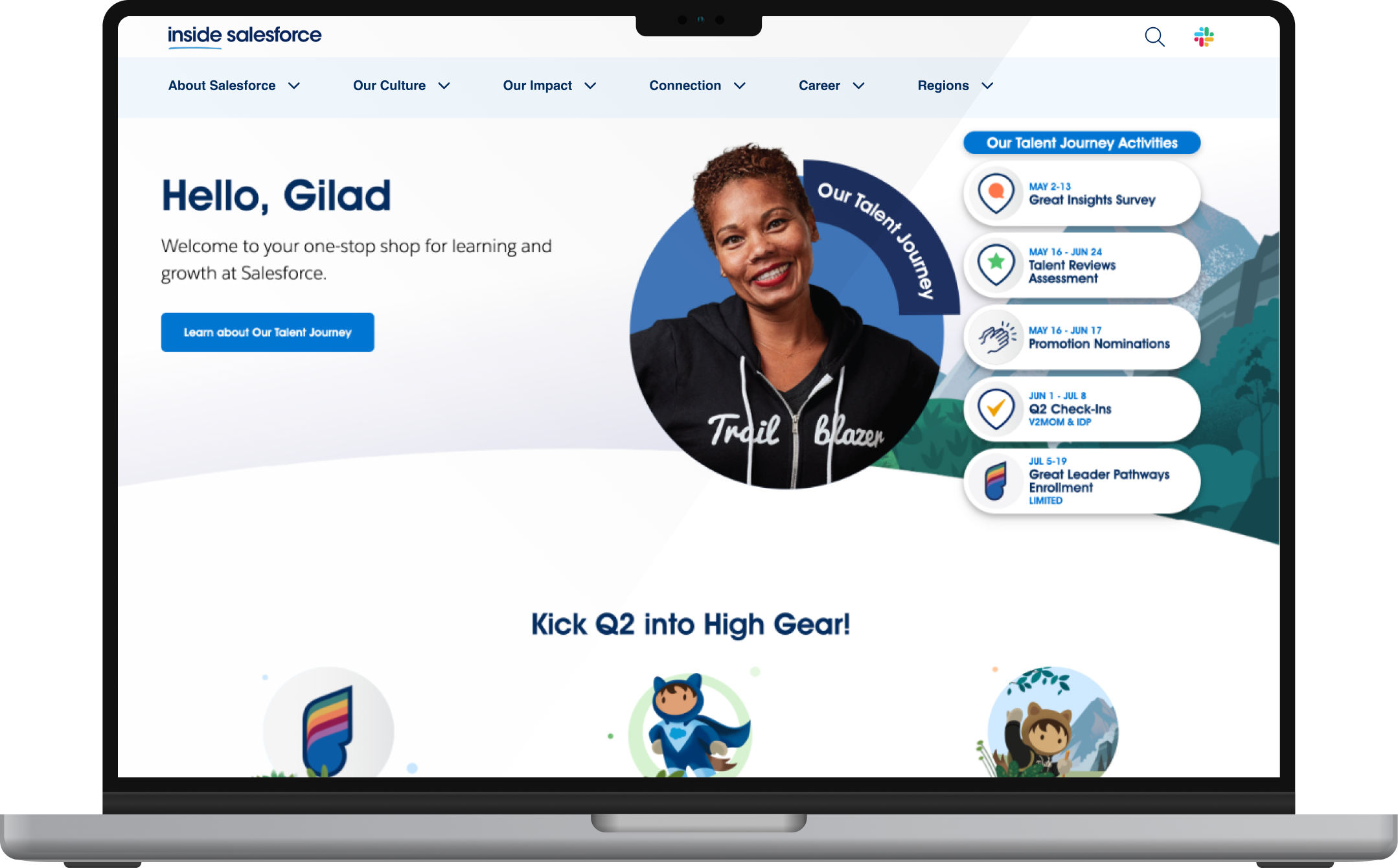
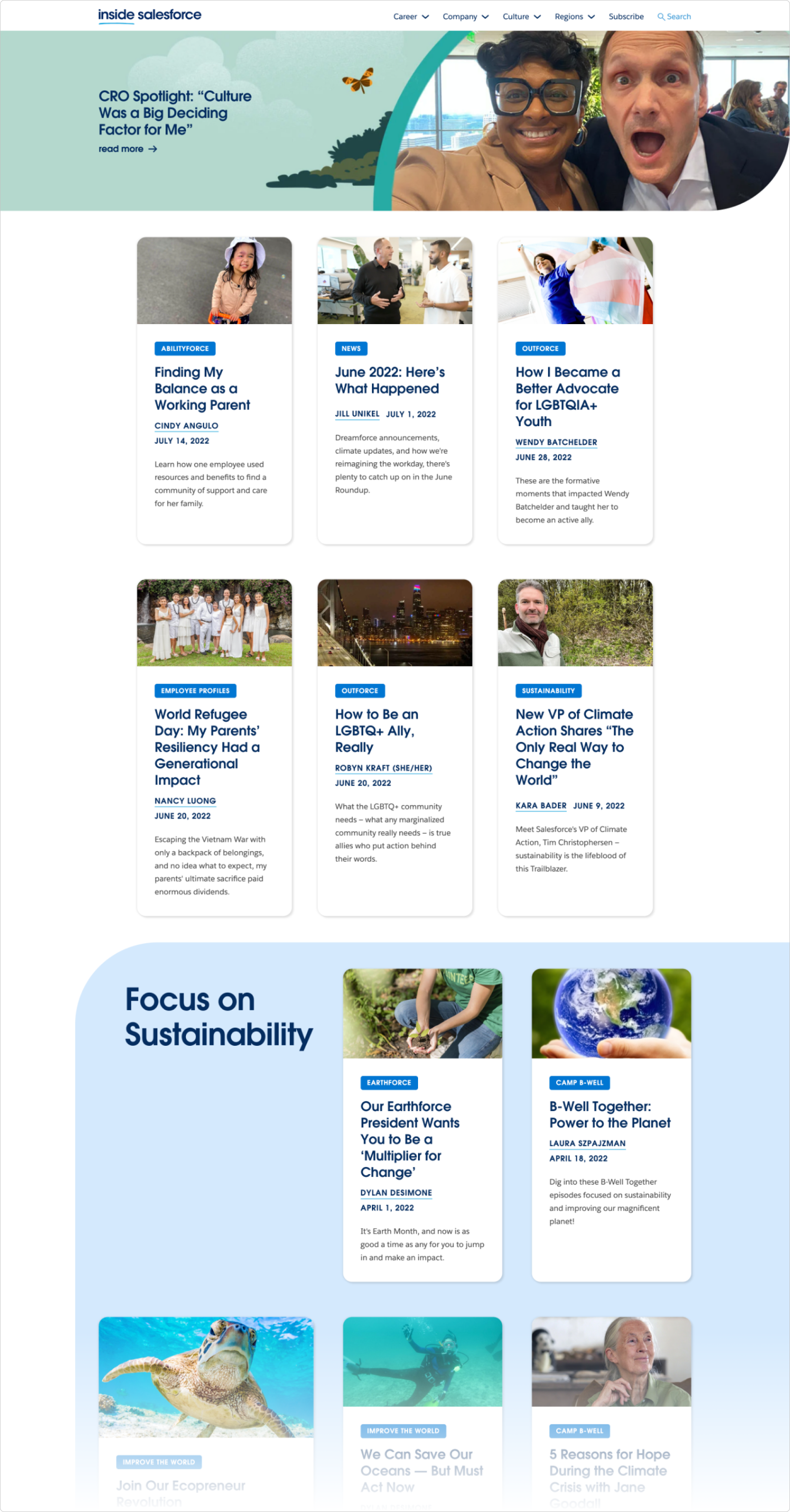
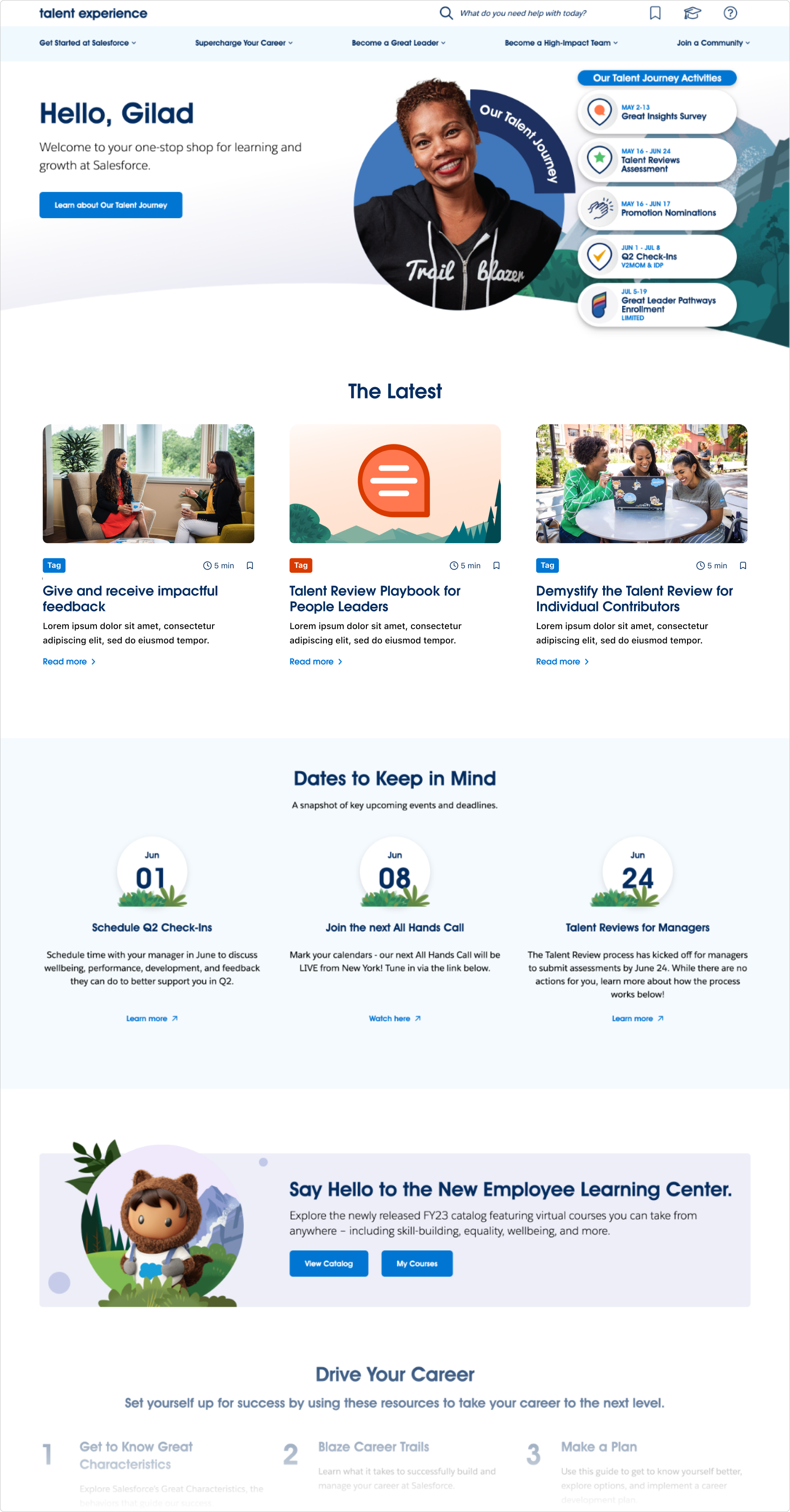
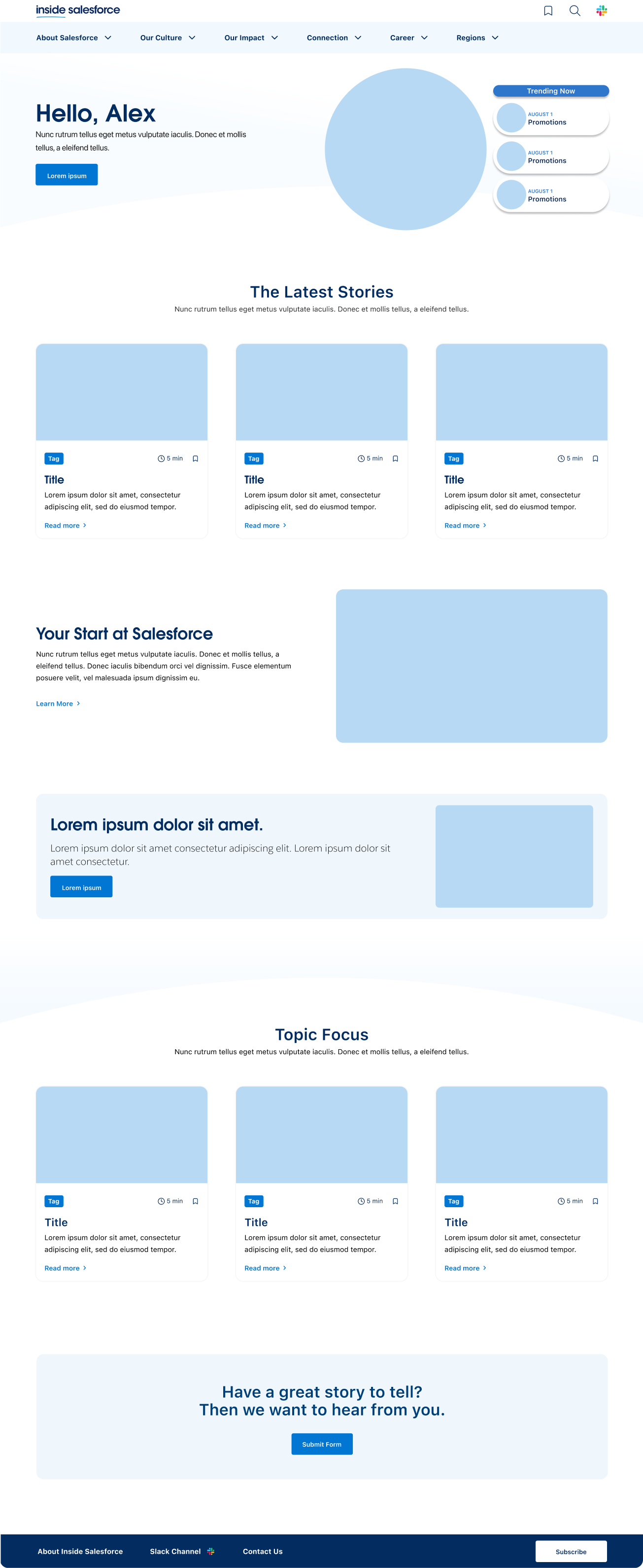
Before
After
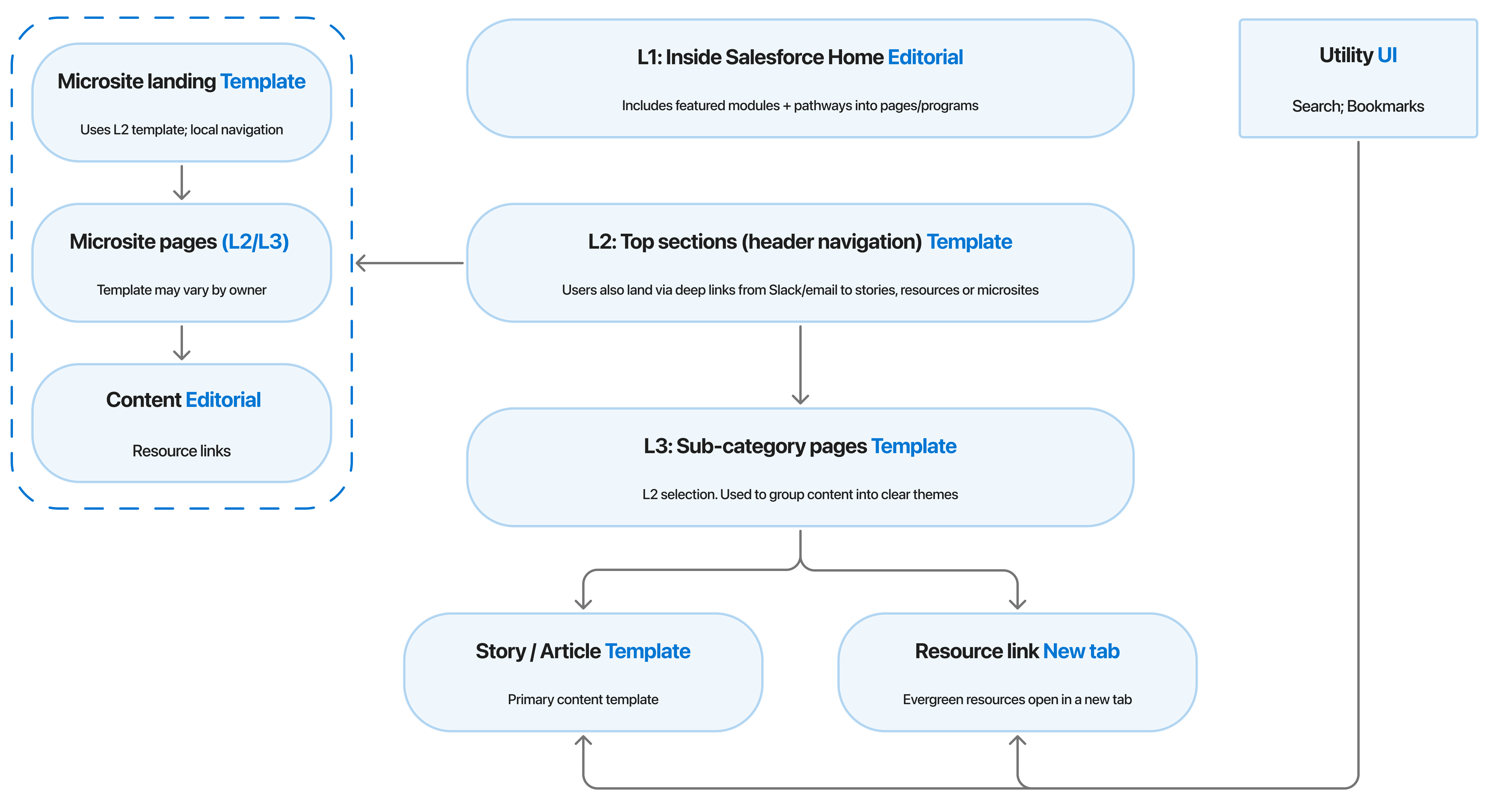
Context
Inside Salesforce is an internal content hub intended to serve both evergreen resources and timely updates—while also supporting “microsite-like” areas under a shared umbrella.
Challenge
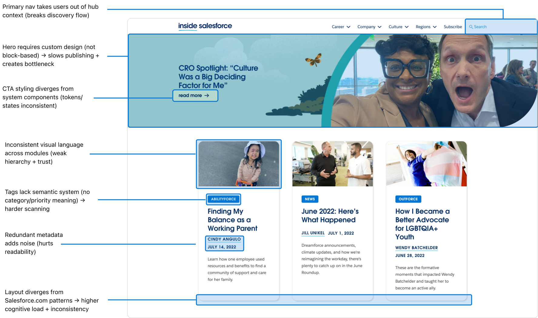
Employees struggled to find relevant content quickly because resources were fragmented and navigation patterns weren’t consistent. The publishing workflow also needed to work for non-designers inside WordPress, which increased the risk of layout drift and inconsistent brand application over time.
Objective
Create a scalable system that:
- Improves content discovery through clearer IA and navigation
- Supports microsite-style sections without fragmenting the overall hub
- Standardizes layouts so pages stay consistent regardless of author
- Enables self-serve publishing through templates, blocks, and documentation
Research
Understanding better user needs
Interviews
I led a session with stakeholders to create a proto persona representing our target user—company employees. While we understood the general audience, we needed deeper insights into their motivations to empathize better throughout the project.
- Better content discovery and navigation
- Easier content management for non-designers
- Visual and structural consistency with Salesforce.com
Current state and
competitors’ features
competitors’ features
I audited the existing blog—marking pain points, inconsistent layouts, missing affordances. Then I looked at other enterprise blogs and internal content hubs to see how they handled navigation, microsites, and content governance.
Design process
From the toolkit, I created reusable templates in Figma
System Alignment & Extension
I cataloged existing modules from the internal web design system (cards, banners, grids). I mapped which of these could be reused directly and where I needed to build new ones.
New components (for example, a secondary navigation bar for microsites) were built to follow the system’s spacing, typography, and token logic. In Figma, I used variants and properties so the components could flex for different page types but still respect the design system’s rules.
New components (for example, a secondary navigation bar for microsites) were built to follow the system’s spacing, typography, and token logic. In Figma, I used variants and properties so the components could flex for different page types but still respect the design system’s rules.
Wireframes & Early Prototypes
I created low‑fidelity wireframes to validate the page structure and navigation model before committing to high‑fidelity UI.
These layouts let us test key flows—scanning the homepage, finding stories quickly, and moving between categories and microsites—while keeping feedback focused on information hierarchy, content grouping, and wayfinding rather than visual polish.
These layouts let us test key flows—scanning the homepage, finding stories quickly, and moving between categories and microsites—while keeping feedback focused on information hierarchy, content grouping, and wayfinding rather than visual polish.
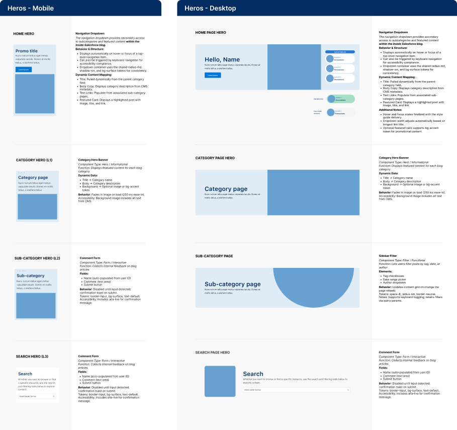
Feature highlight
Second navigation bar
To support microsites under the blog, I introduced a secondary nav bar. When a user scrolls into a microsite, this nav replaces the primary so that navigation stays relevant to that content domain.

Usability testing
Validating the design
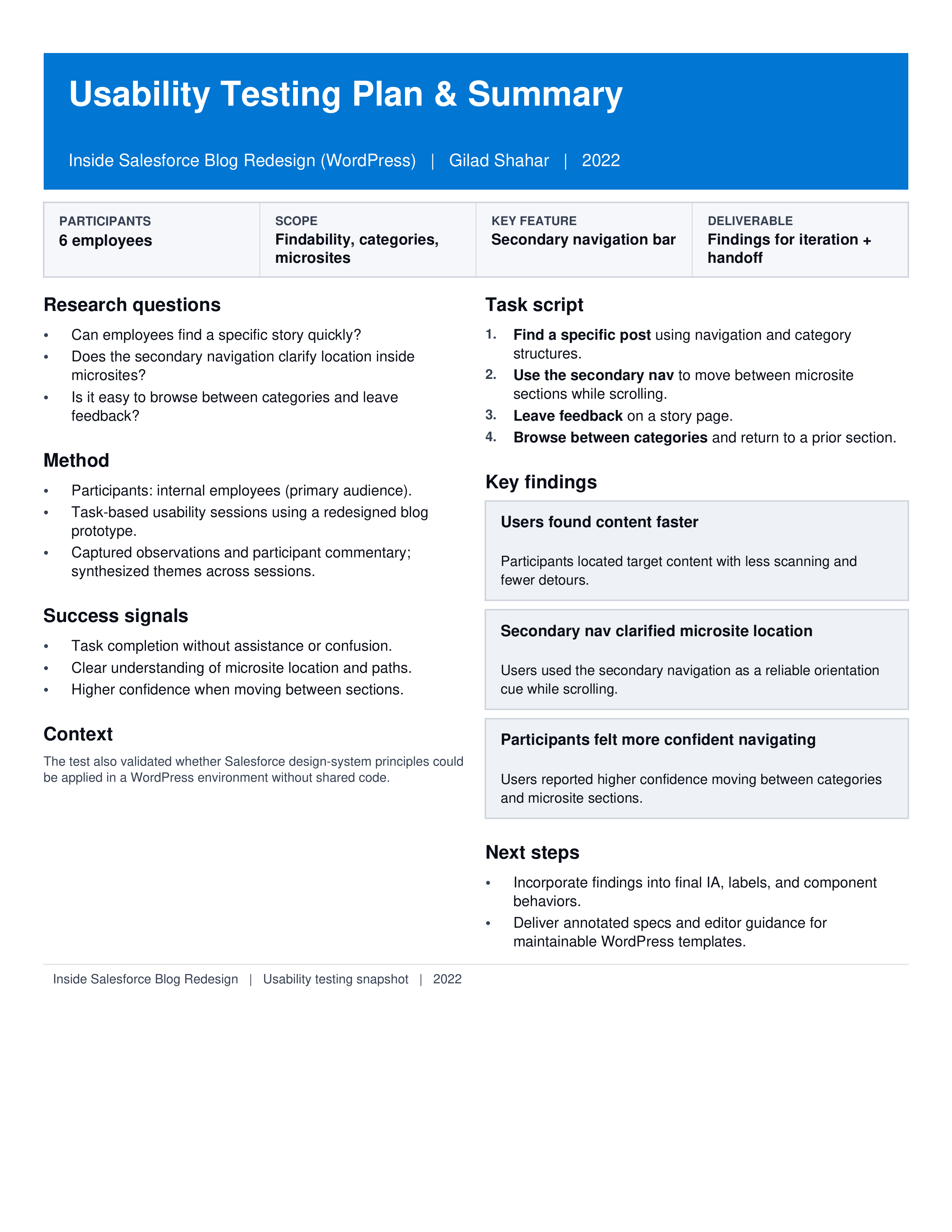
Usability Testing Plan
Before testing, I documented a lightweight plan to keep sessions consistent and actionable: participant profile, core tasks, success criteria, and the specific UI areas under evaluation (navigation, content discovery, and feedback flows).
This ensured we captured comparable insights across sessions and translated findings directly into prioritized design refinements and developer-ready updates.
This ensured we captured comparable insights across sessions and translated findings directly into prioritized design refinements and developer-ready updates.
Developer Handoff & Documentation
To make the system truly self‑serve, I wrote simple, visual instructions directly in Figma
Developer Handoff
I prepared detailed, annotated Figma specs. Each component was cross-referenced to the internal web system’s pattern or extension. I included spacing, states, typography, and notes for interactions.
Style Guide & UI System
To keep the redesigned blog consistent after launch, I created a practical style guide that documents typography, UI patterns, and component states (default/hover/disabled), aligned to Salesforce token logic.
This became a single source of truth for both developers and content owners—making it easy to build new pages, reuse components correctly in WordPress, and maintain accessibility and brand consistency without needing ongoing design support.
This became a single source of truth for both developers and content owners—making it easy to build new pages, reuse components correctly in WordPress, and maintain accessibility and brand consistency without needing ongoing design support.
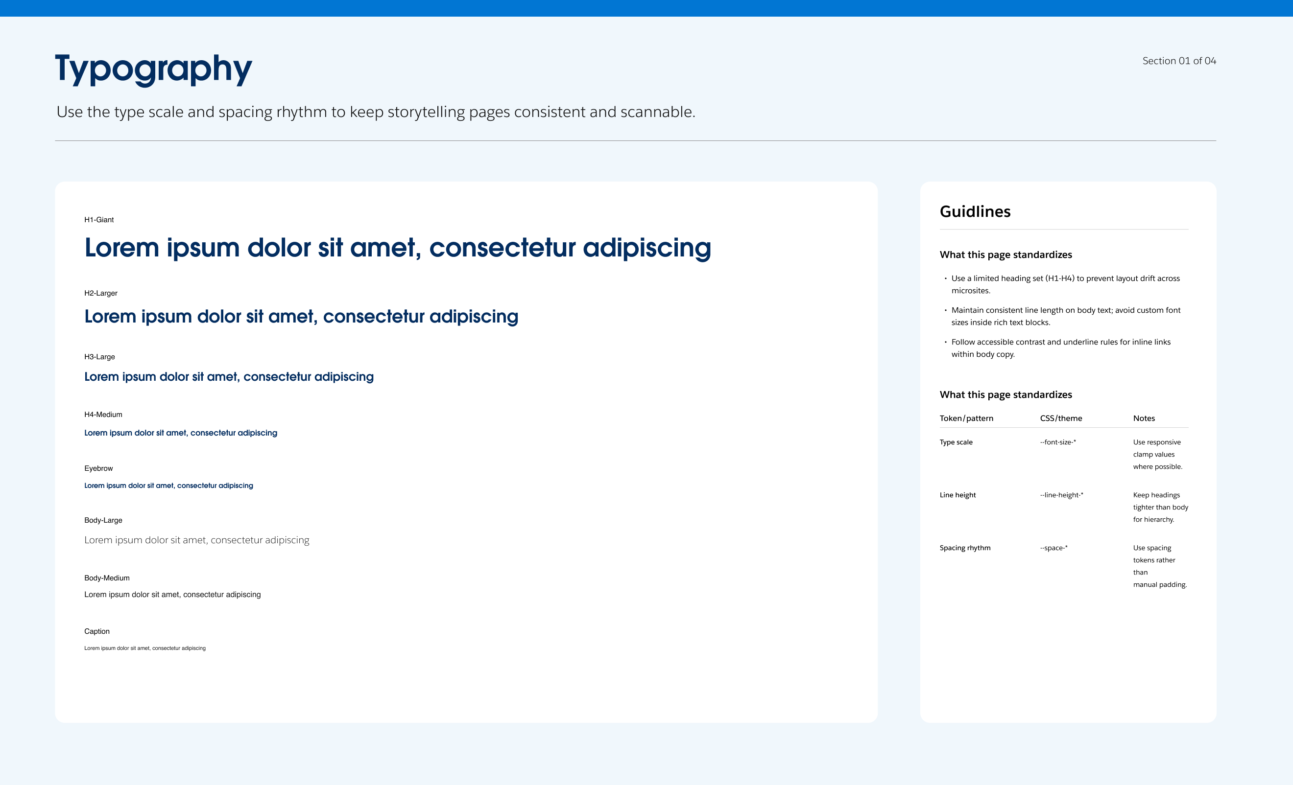
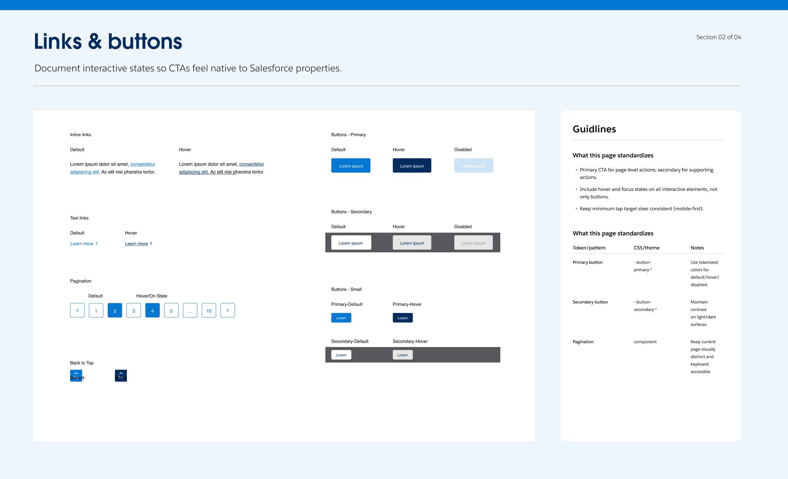
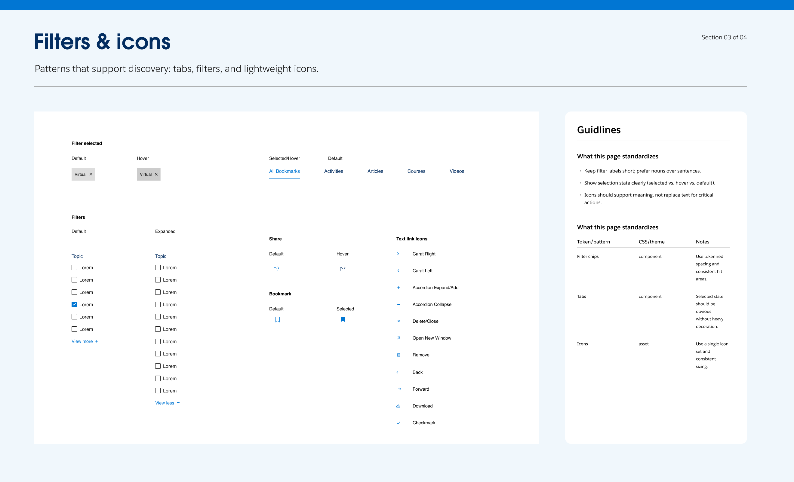
Style guide development for
blog owners
blog owners
To maintain consistency as team members may change, I also developed a comprehensive style guide in spreadsheet form. This guide detailed each new element used to create and edit blog pages, serving as a single source of truth for the team. The style guide included use cases, character counts, and an overarching explanation of the design process with names and references for future inquiries.
